Hudson MX Style Guide & Brand Overhaul
When I began working at Hudson MX, one of the things that the CMO brought to my attention was that the company’s style guide and overall brand standards needed a revamp. Years before my hiring, they had used an outside agency to create their brand identity and style guide. The CMO was unhappy with several of the standards they set (namely fonts and color usage), and had stopped following them.
From their input, I was able to solidify the standards and build a style guide that modernized their brand identity.
The original style guide used typefaces and color schemes that the marketing department found to be antiquated and unaligned with their identity as a modern software company.
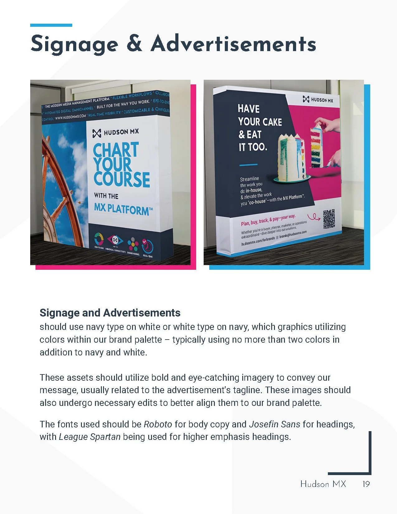
The new guide completely reworked Hudson’s brand identity – utilizing more modern graphics, more rigid color use rules, and fashionable sans serif fonts.
Front Cover
Front Endpaper
Table of Contents
Back Endpaper
Back Cover
Content © Hudson MX Inc.


